By Emmanuella Abraham
Imagine walking into a room and feeling an instant lift or calm simply because of the wall colour. As it turns out, our brains are primed to react to hues: white walls might feel blank or even sterile, whereas warm or bold colours can make us feel grounded, cozy, or energized. In fact, interior designers around the world are actively ditching all-white spaces in favour of palettes that play on mood and meaning. It’s a dramatic shift – after decades of white-on-white minimalism, colour psychology is taking centre stage in modern interiors, and the trend shows no signs of slowing.
The Waning Era of White
For generations, white walls were the “safe” choice: light, neutral, and thought to make rooms look larger. But many experts now see that white can also feel cold and sterile. Colour psychologist Karen Haller notes that while “white is pure and unblemished” and can feel peaceful, it “can also be perceived as cold, uncaring and sterile”. In practice, designers say plain white often leaves rooms feeling flat or insipid. Southern Living quotes Mary Frantz Roberts of Dunn & Hall Interiors urging people to “move away from white-washed homes,” since white “often overdone to the point… it can drain a home of potential personality that colour easily adds”. Likewise, decorator Kelly Neely observes that “rooms with colour and depth are so much more inviting and intimate” than monochrome white spaces.
Gone are the days when everyone painted every wall white “because it’s safe.” Today’s interiors often feature rich earth-tones, jewel brights or soft pastels instead. (See examples above: deep mocha and olive tones, a mustard-yellow accent wall, a lilac study – all infused with warmth.) Even advocates of white admit its limits. New York designer Miranda Cullen concedes that bold, colourful rooms are “very ‘in’ right now,” though she still calls classic white “timeless”. The consensus, however, is clear: while white won’t vanish completely, homeowners and pros alike are tired of sterile spaces. Many now prefer “warmer neutrals” and moody colours to lend life and personality.
How Colour Affects Mood
Behind this shift is growing awareness of colour psychology. Decades of research show that colours powerfully shape our emotions. As one industry expert puts it, “colors surrounding you can powerfully shape your emotions and perceptions”. Blues and greens (ubiquitous in nature) tend to be calming – Sherwin-Williams notes that “blue is soothing and relaxing,” ideal for bedrooms and baths. Green also feels familiar and fresh, since it’s abundant outdoors. In contrast, warm hues like red, orange and yellow naturally energize us: red evokes passion and energy, yellow creates an “uplifting” and “cheery” mood, and orange combines the warmth of red with the brightness of yellow to radiate happiness.
Interior designers are taking these lessons to heart. The recent “dopamine décor” trend is literally about using vivid colour to spark joy. Psychology consultant Lee Chambers told Real Homes that “bold, intense colors in our spaces can generate physiological and psychological responses”, triggering dopamine releases that boost happiness. In practice, this means paint palettes of hot pinks, electric blues, fiery oranges and sunny yellows all over the walls – a direct contrast to the neutral minimalism of the past. Even subdued palettes now lean warm: designers report a pull toward cosy taupes, ambers and caramel browns that feel nurturing. (Kelly Hoppen, famed for her beige schemes, points out research suggesting a neutral palette can actually be better for our nervous system.) In short, colour is no longer mere decoration. It’s being used intentionally to create specific moods – calmer, warmer, or more cheerful spaces – and that is reshaping interiors everywhere.
Warm Neutrals and Earthy Tones
One clear trend is the return of earthy, grounded neutrals. Far from being plain, the new neutrals are richer and warmer. Think deep cocoa-browns, terracotta, olive and mustard. Elle Decor reports that designers are enthusiastic about “complex muddier pink, purple, green and yellow tones that have earthy, grounded bases”. As one Elle A-list designer notes, brown is the colour of the moment – “no sign of slowing down” after ruling 2024. In fact, a survey of design experts found that Stainmaster’s chocolaty “Truffle” brown was the favorite colour-of-the-year for 2025. Sherwin-Williams, rather than pick one shade for 2025, debuted a palette led by a medium brown called “Grounded”.
Rich warm neutrals not only look sophisticated but play on the psychology of comfort. Livingetc observes that interiors are now filled with “butterscotch, chocolate, and terracotta” – tones that are “enveloping and cocoon-like,” reflecting a desire for home to feel nurturing. Designer Emma Shone-Sanders echoes this: she sees “a pull towards warm neutrals that are comforting and easy to live with… creating a space you feel peaceful in”. Green tints also creep into this neutral scheme – sage and olive pair beautifully with creams and woods – bringing a nod to nature. (“It’s not about bright, anything too neon,” notes Kelly Hoppen – instead we’re decorating with “muted, earthy hues that act like neutrals”.)
Even rooms that read as “neutral” today often feature subtle colour. Consider a lounge painted in deep olive-green, paired with wood and plush fabrics. It feels calm and timeless, yet far more interesting than plain white. Texture is key: a white couch or plaster wall can take on warmth when surrounded by those richer neutrals. In this way, the color spectrum of “neutral” has broadened. The new neutrals deliver all the serenity we crave but with depth and personality. Interior expert Laura U wrote that future colour trends will be “characterised by a blend of nature-inspired hues, personalized colour” schemes rather than anything stark. In sum, brown, beige and other warm tones are the new canvas — moody and grounded, yet still subtly enlivened by their warm undertones.
Bold Colours and “Dopamine Décor”
On the flip side of calm neutrals is the fully chromatic approach: dopamine décor. This joyful trend (especially popular with Gen Z) encourages unapologetically vibrant, saturated walls and accents to boost mood. After pandemic lockdowns, many people began reimagining their homes “not as neutral refuges but as energizing and inspiring spaces”. The TikTok hashtag #dopamineroom, for example, shows countless makeovers turning boring nooks into kaleidoscopic retreats. In Britain, Gen Z decorators have famously “replaced beige with bold colours to boost mood, personality, and self-expression”.
Search interest in this style has surged, Pinterest found a 280% jump in searches for “dopamine decor” by early 2025.
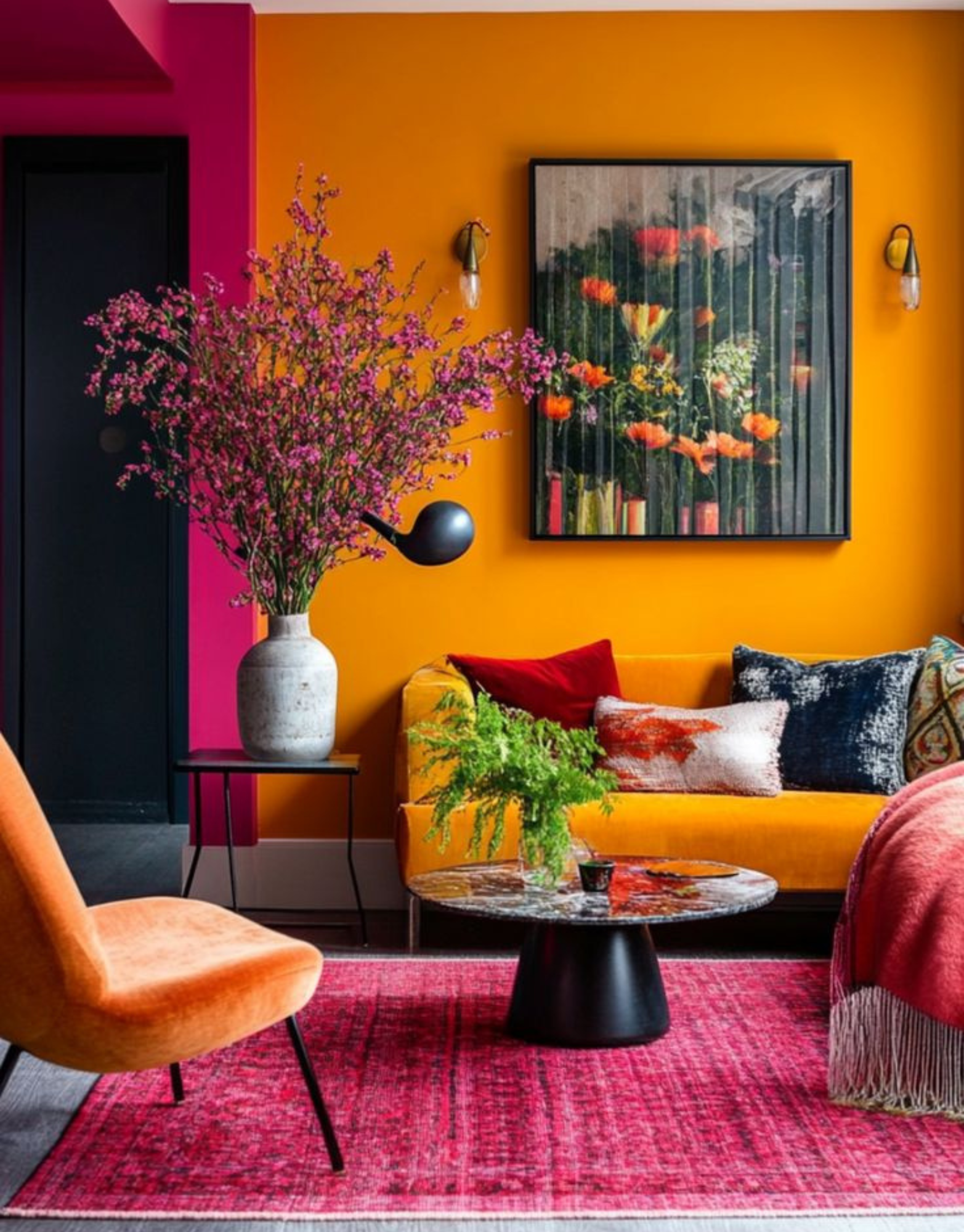
Designers championing dopamine décor mix hot pinks, emerald greens, fiery oranges and bright yellows freely. As Dunn-Edwards notes, the theory is that “colour temperature, saturation and intensity” are key – there’s no rule but to go bold with the hues that make you happy. Kristen Fiore, a Californian designer, predicts 2024 will “fully embrace bright hues” and cheerful colours (blushes moving to coral, mustard yellow brightening) to set a positive mood. Similarly, Benjamin Moore’s color director Helen Shaw praises yellow as “the epitome of an uplifting hue” that instantly warms a room. And in practice, whole rooms are painted in single colours now (a technique called color drenching), from emerald-green living rooms to canary-yellow kitchens.
For a vivid example, consider a study painted a rich marigold-orange, accented with a red console and teal trim. This room buzzes with energy and personality, exactly the point of dopamine decor. Psychologist Lee Chambers explains that such bold schemes can even trigger nostalgia and positive memories, which turns decorating into an act of self-care. Another sign of the shift: many millennials (and brands like Etsy) have embraced earth-tone maximalism, declaring that “brown is back” and even more adventurous mash-ups (dusky pinks with terracottas, olives with chocolates) evoke harmony. In short, the pendulum has swung from one extreme to the other: from ultra-minimalist white to maximalist colour, all in the name of how it makes us feel.
Voices from the Experts
Interior and psychology experts universally agree that colour choices matter. Karen Haller (color psychologist and author) sums up the white debate: white “gives a feeling of peace and quiet,” but can just as easily feel “cold” and “uncaring” if overused. UK designer Lara Apelian recommends layering white with warm hues and textured surfaces so it doesn’t feel “stark or soulless”. On the other hand, Melissa Read of Studio Burntwood warns white’s “overused” in tiny bathrooms, where a deep colour or pattern will create the drama and depth that white cannot.
Across the board, designers find coloured rooms more engaging. Mary Frantz Roberts of Texas urges “goodbye to white-washed” homes, and San Francisco designer Erin Sander says clients are swapping “crisp blue palettes” for olive, clay, amber and brown, relishing the warmth they bring. Even houses that favour neutrals are tweaking them: Emma Shone-Sanders sees 2026 neutrals including “warm, pared back colours…like understated rusty shades and tonal greens” paired with soft woods. In other words, even when spaces aren’t boldly colourful, the subtle palette has warmed up.
Not every expert wants zero white, many simply advocate balance. Atlanta designer Beth Webb, for example, insists that she’s “always been drawn to” white because it feels “serene and calm” amid life’s chaos. But she underscores her trick: texture is my colour with white, preventing it from feeling clinical. This consensus view surfaces again and again: colour brings character and comfort. As Ruth Mottershead of Little Greene says, one of the most steadfast rules in painting is to sample before committing, since light alters colours dramatically – a reminder that thoughtful use of hue (warm vs cool) can either cozy up or cool down a room. In practice, experts advise blending creativity with caution: paint an accent wall first, test under different light, or start by “color drenching” a small room. The takeaway is unanimous: colour is powerful, and wielded well it can make a house feel happier, more personal and emotionally resonant.
Bringing Colour Home: Practical Tips
- Start small and sample. Before committing, test paint swatches on different walls and observe them through the day. Lighting (north vs south exposure) can make a shade read very differently, so sampling is essential.
- Experiment with accent walls or ceilings. Even one painted wall can transform a space. Designers also urge not to ignore the “fifth wall” – a ceiling in a fun hue can make a room feel cozier. (If bright ceilings daunt you, try a warm neutral on the ceiling as a compromise.)
- Embrace color drenching or bold accents. Monochrome schemes (walls, trim and ceiling in one shade) are trending. If that’s too much, start with vibrant doors, window frames or cabinets. Even colourful rugs, artwork or throw pillows can introduce a dopamine-worthy pop.
- Balance with neutrals and texture. Juxtapose bold walls with natural materials (wood, linen, stone) or rich fabrics (velvet, boucle) to keep energy balanced. Soft furnishings in complementary tones can tie it together. As one expert advises, if using a vivid colour like lilac, layer it with creamy whites and warm woods – avoid stark black contrasts.
- Follow your joy. In the spirit of dopamine décor, use colours that you love. There’s no single right palette – rather, it should reflect what makes the inhabitants feel good. As one designer put it: if it makes you smile, it belongs in your home.
A Colourful Future
White walls aren’t dying so much as evolving. The real story is that interior design is taking psychology more seriously: every colour choice now carries intentional weight. Science tells us that warm tones can comfort and cool tones can calm, while vibrant hues can energize and uplift. Designers and homeowners are listening. Warm neutrals (terracottas, caramels, soft greens) are being embraced as grounding and restful, and at the same time, fearless colour is bursting in through dopamine-driven trends. This rich palette means our living spaces will soon feel as colorful as our Instagram feeds and as mood-aware as our wearable health trackers.
In practical terms, the “death of white walls” means we can look forward to homes that feel more personal, characterful and mood fit. Instead of blank canvases, walls will act like mood rings: soothing us with soft lilacs or energizing us with bold yellows. Whether your style is soothingly neutral or playfully painted, the choice of colour will be a deliberate one. As one trend expert puts it, 2025 and beyond will usher in colours that “feel familiar yet nuanced” – a depth that’s “enduring, rooted in a timeless narrative”. In short, the future of interiors is vibrant and psychologically attuned: white may remain for ceilings and trim, but the era of walls-as-canvas is truly back in colour.